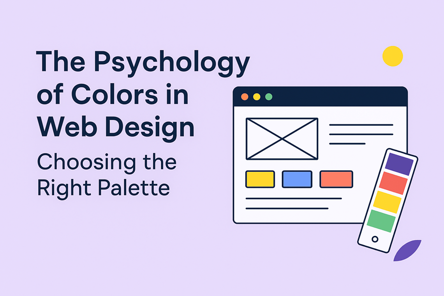
The Psychology of Colors in Web Design: Choosing the Right Palette
When it comes to web design, visuals play a powerful role in shaping how visitors perceive your brand. Among all design elements, color psychology has the strongest impact on emotions, trust, and decision-making. The right color palette can improve user experience, influence purchase behavior, and even define how credible your website feels.
At Web7 Design, we help businesses in Dubai and across the UAE craft digital experiences that not only look stunning but also connect emotionally with their audience. Let’s dive into why choosing the right colors for your website matters.
Why Color Matters in Web Design
First Impressions Count – Studies show users form an opinion about a website within 0.05 seconds, and colors are the first element they notice.
Brand Recognition – Consistent use of brand colors increases recognition by up to 80%.
Conversions & Sales – A strategic color scheme can guide visitors’ eyes toward calls-to-action (like “Buy Now” or “Get a Quote”), boosting conversions.
The Psychology Behind Popular Colors
Here’s how some of the most commonly used web design colors impact user behavior:
🔵 Blue – Trust, reliability, professionalism (popular with banks, healthcare, and corporate brands).
🔴 Red – Energy, urgency, passion (great for sales campaigns or limited-time offers).
🟢 Green – Growth, nature, wealth (ideal for eco-friendly brands, finance, and wellness).
🟡 Yellow – Optimism, creativity, warmth (works well for youth-focused or creative businesses).
⚫ Black – Luxury, sophistication, exclusivity (favored by premium and fashion brands).
Understand Your Audience – A corporate audience may respond better to blues and greys, while lifestyle brands can explore vibrant colors.
Stay Consistent with Your Brand Identity – Your website colors should match your logo, social media, and marketing materials.
Use Contrast Wisely – Contrast highlights CTAs and improves readability (e.g., white text on dark backgrounds).
Balance Emotion with Functionality – While colors create mood, usability and accessibility must remain priorities.
Test & Measure – A/B test different button or banner colors to see what resonates most with your audience.
Examples from Dubai Market
Luxury real estate websites in Dubai often use black and gold to showcase elegance.
Tech startups prefer blue and white for a trustworthy, modern feel.
E-commerce stores experiment with red and orange to drive quick decisions during sales.
Final Thoughts
The psychology of color is more than just aesthetics—it’s about crafting a user journey that feels natural, trustworthy, and engaging. Whether you want to convey luxury, innovation, or energy, the right palette will help your brand stand out in Dubai’s competitive digital space.
At Web7 Design, our team blends creativity with strategy to design websites that don’t just look good but also convert visitors into customers.
👉 Ready to refresh your website with a powerful color palette? Contact Web7 Design today and let’s build a design that speaks your brand’s language.